

In this post we will see 6 fundamental aspects to take into account to correctly use typography in our texts. In relation to this, we will see how typography is perceived and the importance of it to generate visual impact.
How to use typography correctly.
Key concepts of typography.
Typography is a fundamental principle in the vocabulary of a designer, because it has a dual function: verbal and emotional.
Although we see typography primarily as a series of elements that combine to form words and phrases, it also has a purely visual function. In this sense, the typography is a pure graphic element, as is line, color, shape or texture.
When typography only relates to its verbal meaning, its communicative function may lack visual impact.
The letters speak.
Like the “colors sound” as we saw in this post about the perception of colors, in this case we perceive typography on two levels.
The first, its verbal and communicative level, refers to its ability to transmit thoughts.
“The whole point with type is for you not to be aware it is there.<br>
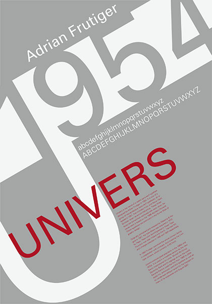
Adrian FrutigerDiseñador suizo de la tipografía Univers.
If you remember the shape of a spoon with which you just ate some soup, then the spoon had a poor shape.”
In particular, we stress that typography must be clear, especially in the text paragraphs.
In general, a text is easy to read when it “becomes transparent” in the eyes of the reader and allows reading without interference.
1. Readability.
The most important influences on the legibility of a text are illumination, contrast, resolution, distance and font size.
It should be added that not all typeface families work well for small sizes. So when choosing a typeface, think about the size you will have to use it in and check that it works.
And first of all, we must take into account to whom the text is addressed, and what type of text it is. For example, if we are designing a text for a book, choose fonts for books, in the same way, if it is to design a billboard, investigate what types of letters are used in this medium.
But the readability of a text can also be compromised by the following concepts: Spacing and alignment.
Mike Joyce / Design for multiple applications
2.1. Space between letters.
In the creation of a Logotype, we must take into account the spacing between characters, to achieve a harmonious composition. To do this, two terms can be confusing: Tracking or spacing and Kerning or matching between character pairs.
Tracking.
In design software you will find this setting defaulted to 0. The tracking will join or space the whole word or paragraph, depending on the numerical value you set.
Tracking or kerning, applied to words, will deform the typeface and create false versions of the condensed or extended typeface. It is always better to use the original typeface family rather than falsify it.
Kerning.
If you need to modify the kerning, start by adjusting it after tracking and use optical kerning. It also defaults to 0. The software will try to calculate a balanced distance for each pair of letters and if it doesn’t work, apply the positive numerical value to move the letters away from each other or negative to move them closer together.
Changing the spacing between lower case letters does not usually work as well as it does for upper case letters, which are more amenable to touching the default values. Lower case letters have their origins in handwriting, which is why it is more difficult to touch the spaces between the letters, as this breaks the continuity that they naturally generate.
Adjusting the kerning of logos for our customers
To train the eye by applying kerning to different words, one trick is to squint your eyes away from the screen. This way, by blurring the outlines of the letters, we can better appreciate the differences in spacing between them. One online resource is this website called Kerning Game, which also tells you what typeface is on each screen.
2.2 Line spacing.
In the design of a paragraph text, it is necessary for the space between the lines to be as balanced as possible. This value is called leading. It is best to leave the default “automatic” value, which is given by the design of the typography, especially in long texts.
3. Alignment.
The readability of a paragraph text depends on the alignment of the paragraph.
Aligning to the left is the easiest way to ensure uninterrupted reading.
It is a mistake to think that justified text (as in books) makes the text look neater. The eye has to work harder, as mismatches occur between the lines, causing irregular gaps. Words can be cut with a hyphen. This method of breaking up text is used especially in text that is justified on both sides.
The centred alignment should only be used in headlines, for large areas of text it makes reading very difficult.
In the image below, we see an excellent use of free alignment, according to design requirements.
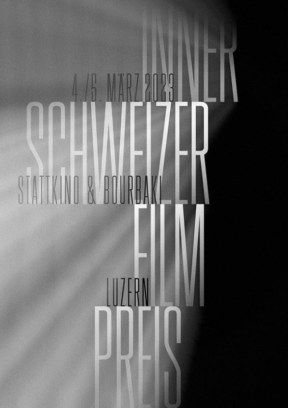
Eric Brechbühl / Poster for the biannual Central Swiss Film Award.
Typography is the message.
The second level of perception of typography is its ability to convey visual impact.
All the communicative power of typography unfolds it, when visual meaning is reinforced. Due to its correct treatment, it is perceived on several levels, not only verbal but also emotional.
Type can itself be the message.
To deny that typography can be exciting or shocking is to limit the expressiveness of a typeface.
A clear example of this is the work of the designer Marta Cerdá.
Marta Cerdá / K Capital - Lettering
4. Typographic Colour.
Typography as a visual composition has characteristics of rhythm, space and texture. This quality is called typographic colour. It does not refer to the colour used in the typeface, but to the density of its structure.
From what has been said above, it is easy to deduce that kerning, tracking and leading are closely related to typographic colour. A very small tracking “darkens” the text, while applying large values “lightens” the text.
A change in this tonal density or typographic colour in a composition influences not only its appearance but also the meaning of the message. It allows a page to stand out and give strength to a page.
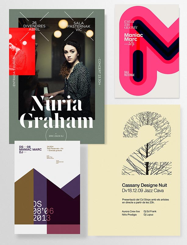
Quin Marin / Posters for musical events
5. Style.
The most basic classification of typographic style is based on the shape of the letter caps. Serif or Sans Serif.
In principle, serif typefaces are the most commonly used in reading texts, because this support facilitates the natural rhythm between the letters and therefore their readability.
Sans serif typefaces give a more modern look to text design and are therefore more commonly used in large sizes for signage or advertising.
Aa // serif //<br>
Free Bodoni
Aa // sans serif // Manrope
However, contemporary trends in editorial design have changed these classic uses of typographic style and today new typefaces are emerging that challenge old beliefs and there is a greater breadth of vision in the use and classification of typefaces.
The website: Fonts In Use is an archive on the current and past use of typefaces in all types of media and mediums.
6. Contrast.
Working with typefaces draws attention to what is most important in the composition, but to do so, hierarchy and contrast between paragraphs and letterforms must be applied.
When combining fonts, they should be sufficiently different to generate contrast. For example, for headlines, use fonts with a higher density than for reading text.
Heading.
And this is a sub-heading that explains or amplifies the meaning of the heading.
The most important tip on the use of typography is not to mix more than two different typefaces. A couple of them, or even just one, is enough to create titles, subtitles and paragraphs with sufficient contrast and interest.
In addition, a typeface family of a quality font has many variations in weight, so we will have bold, italic, light, extended and condensed typefaces, etc.
- Cincuenta y tantos consejos sobre tipografía. Enric Jardí. Ed. GG.
- Website specialising in typography: http://www.oert.org/
- Marco Creativo. Tutorial video on Kerning settings.


