

In this entry, we explain how to design with sense from the beginning in order to optimise work time and obtain satisfactory results. The example of the self-project of the portfolio La Nit de l’Art is given as an example.
Creative processes.
Each professional has their own methodology, the fundamental thing is that you feel comfortable working if you follow a method. I have learned from many other professionals, watching their tutorials and reading design blogs. In the end, I’m left with the fact that the creative process has an order, because the phase of analysing the information and writing a Design briefing, guides me towards the objectives of the project and puts me in my place when the creative vein is unleashed 😉
1. Ideas.
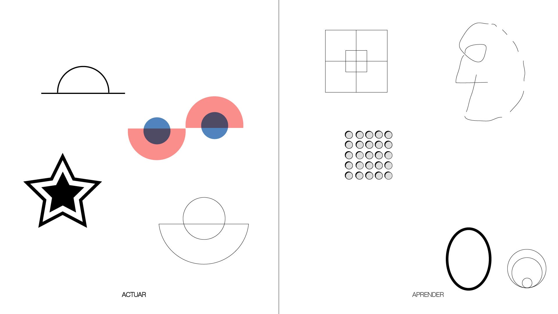
The ideas are written down in a list and relationships are established between them. In this simple and quick way, the creative process begins. Often, it is a matter of taking notes of what is going through our heads, however absurd it may seem, it can be useful. We can call it Brainstorming, or whatever we want. The important thing is to take the time to think and analyse these ideas and put them into context.
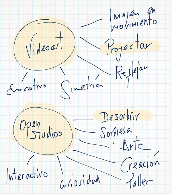
Mind Diagrams / Ideation Phase
For example:
For the self-project La Nit de l’Art we worked with the premise of creating 6 posters about the events of the Festival: Video Art, Installations, Performance, Open Studios (guided visits to the workshops of local artists), Conferences and Creative Workshops for children.
In the mental diagrams generated, it was concluded that using a verb to work on the concepts of each event would help to come up with more dynamic solutions. At the same time, by unifying the criteria I will achieve just that, unity of the whole.
2. Exploration.
1. Hand sketches.
Once we have the sketches created, we will choose from each of the series the ones we find most interesting and then develop them on the computer with the vector drawing tool we use.
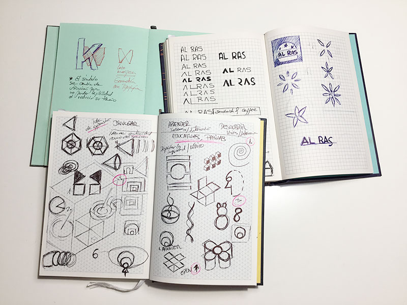
Manual sketches / Exploration Phase
2. Exploring creative routes.
With the hand drawing we have managed to awaken the ideas, now with the computer we reproduce the simple shapes we have chosen from each series, so that we can experiment with them digitally.
During this phase it is very important not to work with colour other than as a filler or shading, as the final colours for each poster have to be decided together. In this process, we will realise that some shapes work and others do not. We will have to choose one shape from each of the series, bearing in mind that the creative technique must then be unified, as some shapes have fills, others only strokes or both, and some even have three-dimensional effects.
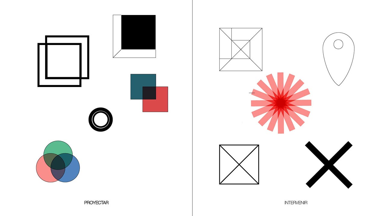
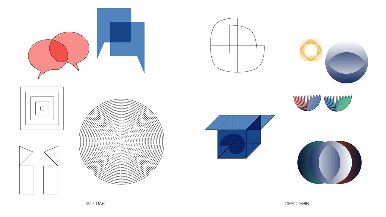
Digital Sketches / Exploration Phase
3. Design.
3.1. Building a visual system.
At this stage, we have already started to make some decisions and it is becoming clear which shapes work for each series. Or, which ones are interesting and we can develop them further to be able to incorporate them into another series for which we have not found any satisfactory form.
Don’t forget where we are going and keep in mind at all times the following aspects to resolve:
- Select a visual from each series that is formally related to the rest.
- Think about the chromatic palette taking into account that each colour is sufficiently contrasted from the rest.
- Decide which restrictions we are going to apply to simplify and unify the result.
Tip :
This process is the one that usually takes the longest and it is advisable to let the project rest and come back to it a few days later to look at it again and take it up again.
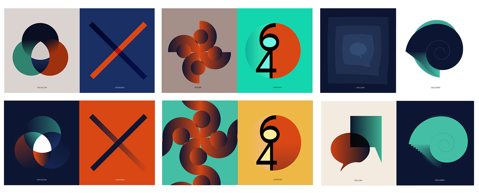
Digital Sketches / Design Phase
Thinking out of the Box.
The use of restrictions helps a lot to find more creative solutions and be able to think out of the box.
For example, in this project, a constraint that was very difficult for me to assume but that gave excellent results was the use of shapes without strokes and gradient colour.
3.2. Colour palette.
In the previous phase we have experimented with colour but now it is time to reduce the colour palette and also to bear in mind that interesting gradient colour tones must come out of these colours.
Tip :
To help the eye to see the contrast between the shades of colour, relate the chosen colour palette to a palette of black and white colours with sufficiently contrasting shades of grey.
1
2
3
4
1
2
3
4
La Nit de l'Art - llustrations
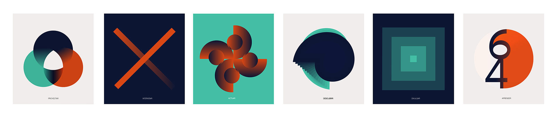
Final Illustrations / Design Phase
3.3. Layout.
Once the illustrations of our posters have been created, we focus on aligning the text of each image so that it always appears in the same place.
To do this, after selecting the fonts we are going to use and deciding where they are going to appear in the design, we make a grid.
The final format will be decided based on whether it is going to be a printed project, a digital project or both. In the case of a print project, it depends on the formats that the printer works with and it is convenient to know this before starting.
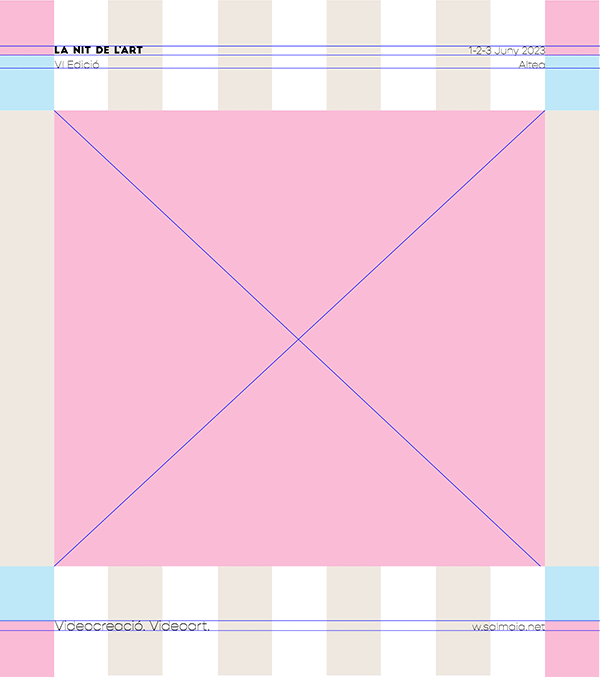
Text layout / Design Phase
The choice of typography in a graphic design is very important, there are many aspects to take into account. In this post: How to use typography correctly, I address the issue. Using typography well in a visual communication makes the message effective. Fundamental aspects are: the selection of typography, its size, alignment, color and spacing.
Tip :
Never use more than one pair of typefaces and if used, use sufficiently different typefaces to create contrast and make it easier to read.
Conclusion:
Images created with simple shapes generate strong and universal messages. When we design, a good method is always to ask ourselves if there is any element in the design that is too much and if eliminating or reducing it achieves the same or a better result.
In a previous post Graphic Design and Visual Perception we explain some of the most important graphic design fundamentals and see examples of how this synthesis can lead to exciting solutions.
Created during the Domestika course given by Genis Carreras: Graphic design: communicating complex ideas with simple images.


