

How does a certain color come to mind, which transmits a color to us? Why is this sense of colour so direct and primary?
Color theory explains what color is and above all, how we perceive colors. In this way, we will understand that they are color spaces and what they are used for.
1. Colour theory.
The color is light. Physically color is a perception.
The color theory developed by painters like Kandinsky and Klee, determines that the observation of certain colors produces in us a stimulation similar to that which we can experiment with the vibration that sounds exert in us.
The colors “sound”…
In visual communication we can say that the colors “sound” or produce a certain sound. Colors expand the message taking it out of the typographical context (for example if we refer to a Logo). That expansion of meaning is like the sound of a musical note.
”«The objects that constitute the environment are physically colorless, what we perceive when we look at the sun, towards our environment or looking at our own hands, are sensations and happen only in our brain. What we call color has no place in the physical world, but in our psychic world.»
Juan Carlos Sanz.El libro del color. Alianza.
So we could say that the high-pitched sounds seem to expand through space, they tend to spread. On the contrary, the deep and deep sounds impress us because they concentrate towards the interior. Kandinsky understood color and sound as interrelated elements.
A triangle, for example, would be more pointed, that is, it would cause greater visual tension if we painted it yellow. In the same way that if we painted a circle blue, it would cause a more resounding sensation.
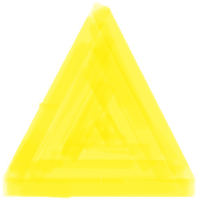
YELLOW – Eccentric – RE minor
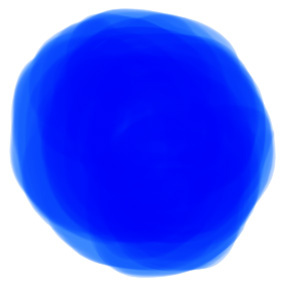
BLUE – Concentric – SI MINOR
2. Color spaces.
Color spaces are color classification systems that serve to explain the relationship between colors according to the space they represent. For example: colors printed in a brochure or a painting are spaces of different color than those we would have on a mobile screen or a television.
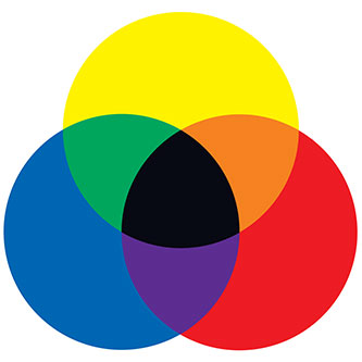
1. The subtractive system.
Formed by the primary colors : Yellow, Red and Blue , so called because they are formed without intervention of any other color and complementary colors: Orange, Violet and Green.
This color space is what we are taught in school and what we can experience if we mix physical colors of paintings. The mixture of colors starting from the primary ones, will always result in mixtures of less luminous colors and mixing all colors result in a color close to black.
2. The additive system.
Instead of painting a surface, we apply a filtered light beam with the three primary colors of light: Red, Green and Blue (RGB color). They are these three primary colors, because our retinas reach the maximum sensitivity in the red, green and blue part of the visible spectrum. This color space has secondary colors: Magenta, Cian and Yellow, emerged from the mixture of luminous beams.
This color space is the one used to have a reference of the colors we see on the screens. The primary color mix gives brighter secondary colors. The white color in this color model is the sum of all colors.
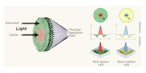
3. How do we perceive colors?
We have said before that colors sound, because another way to understand their nature as to how we perceive them is to compare them with the sense of taste. We perceive colors just as we perceive flavors.
When we eat our taste buds perceive four flavors: sweet, salty, bitter and acid. Likewise, when we see, our visual nerves record some color attributes grouped in the amount of green/red and blue/yellow that the scene we are contemplating has.
The visual nerves perceive green or red, but never both; and blue or yellow, but never both. So we never see bluish yellow or reddish green. You have to realize that these attributes are opposite, like cold and heat. Hence, the colors are classified according to the sensations of cold and warm colors.
The opposition of these pairs of colors (green/red and blue/yellow) forms the basis of the vision of color and has been taken as a basis to define the first precise theories on the perception of color, based precisely on its contrast.
We see thanks to the contrast of light, if there is no light we see no color except black, which is actually the absence of color.