
The Logo is the graphic representation of a brand and, as such, it must communicate and move.
If the graphic image created is memorable and easily remembered, we will have a visual identity. If not, we will have a Logo but nothing more.
1. What is a Logotype?
What a Logo is not, will define what it is.
A Logo is not a drawing or image that contains everything that the project it represents necessarily is or wants to be.
A Logo is not a decorative motif that we like and is pleasing to the eye. It cannot be subjective, because people have different tastes. It must not respond to an artistic intention. The Logo must respond to a strategy designed to communicate.
”Art is an act of liberation.<br>
Design is an act of empathy.
”Design is the method of bringing shape and content together. Design is simple, that's why it is so complicated.
Paul Rand.
The essential characteristic of a Logo is its ability to be reduced to the minimum expression. Both in terms of shapes and colours, so that it can be applied graphically to any support. Visual unity is key in graphic design, that is why, before giving colour, we define the shapes. The Logo has to work in black and white.
Finally, we must clarify that a Logo is not the name of our company or project with a typography that we like, in the same way that a Logo is not necessarily a symbol or drawing. Not all Logos have to contain a symbol to be Logos, but they do, however, have to have letters to name the name of the company they represent.
2. Differences between Logotype, Isologue, Isotype.
The use of Logo or Logotype for everything has become generalised, but it is not entirely correct, although it is important to know that when thinking about the design of a Logo, it is necessary to first carry out a deep analysis of the values that we want to transmit.
2.1. 2.1. Logotype – Contains typography and may or may not necessarily contain a symbol.
A proper Logotype would be a design created only with typography, without a symbol. Think of brands such as Coca-Cola, Walt Disney or Google.
When an icon or symbol is also included, it would be called an Imagotype. For example Adidas or Spotify, but this is less well known.
The symbol or icon can be separated. It can also be independent from the Logo.
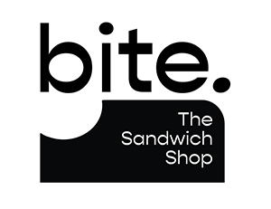
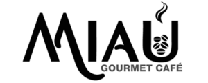
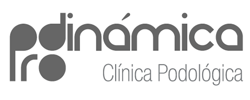
Logotypes
of our clients

2.2 Isotype – The symbol representing the Logo, but without the letters.
Some well-known brands can be identified without the need for a name. For example, Apple‘s apple, or WWF‘s panda bear.
These icons are necessary nowadays, as they allow the application of the Logo on small devices such as mobiles and for your profiles on social networks. However, they do not have to be icons, they can be the initials of the Logo or a monogram.
Ultimately, these icons synthesise the graphic identity of a Logo, but to become a representative symbol of the brand they need to be widely recognised and taken on board. In a new company, the use of these icons is by necessity and they cannot replace the Logo with the brand name.
The Isotypes


2.3. Isologo – Contains typography and symbol but cannot be separated.
It is perhaps the most complete graphic form of the Logo because it combines both the name and the symbol in a single graphic image. They help to reinforce the brand image by including the name in the design itself.
Isologos
Parts of the
Logo
How to choose the most suitable format to create a Logo?
When I work on the design of a Logo , I never start by setting limits or creating restrictions, rather the other way around. In the conceptualisation phase , what I do is a lot of sketches. It usually happens that as the design evolves, some ideas expressed in them, guide me and help me to specify the proposed solution.
In any case, I never consider whether I will make a Logotype, Isotype or Isologo, whatever comes out will depend on the strategies defined in the briefing and will be the most suitable for each project.


