


Graphic design and Visual perception.
Graphic design is an act of communication and as such requires a reading by the receiver of the message. If we know the laws of visual perception and apply them effectively in our designs, we can shape the sender’s perception of the graphic image created.
In other words, if we apply the principles of visual perception to graphic language, we will influence the reading of images by generating content:
- Universal (understood by all)
- Simple (eliminating the unnecessary and accentuating the essential)
- Narrative (able to generate sequences and descriptions)
- Poetic (emotionally memorable).
1. What is Visual Perception?
Images are made up of a series of internal paths, forces and energies that we do not see as such, but which we perceive unconsciously and which direct our gaze towards certain points or hot spots in the image that are more important than others.
In this way, hierarchies are established between the graphic elements of an image and links are created, generating movements that make a visual composition attractive and tell a story.

Nerea Díaz / Civilisations
2. How does Visual Perception take place?
Images are generated in the mind from visual stimuli, and we immediately recognise what we already know from experience rather than what is new or unfamiliar.
Visual language is like an alphabet, perception is conditioned by our prior learning or knowledge of what we see.
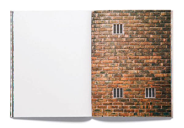
For example, our brain has an innate tendency to perceive objects that are incomplete as complete; this process or ability to fill in missing parts is a visual stimulus picked up by Gestalt Psychology, known as “The Law of Closure”.
The Quick Brown Fox Jumps Over A Lazy Dog.
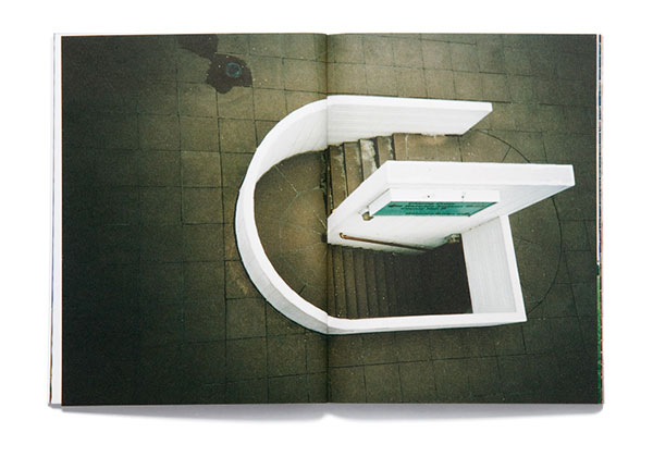
Roberto Beretta y Andreu Llorens.
”These photographs by Andreu Llorens and Roberto Beretta, collected in a book, show examples of a possible urban alphabet from 'A to Z' in London.
The Quick Brown Fox Jumps Over A Lazy Dog.Ed. Corraini. 2008
3. Principles of Visual Perception.
- 1. The Unity.
Law of Closure. Law of Figure and Background. - The Tension or Weight.
Law of Proximity. - 3. Movement.
Law of Continuity. - 4. The Balance.
1. The Unity.
Visual unity in a composition is the essential rule that sets the direction to achieve a clear message with a universal meaning.
Establishing that all graphic elements used in a composition maintain an internal visual unity is essential for the final image to work.
Confusion does not create visual interest.
How is this achieved?
Through the use of similarity and proximity we group elements and create visual paths around them.
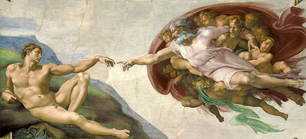
For example, let’s look at Michelangelo’s Sistine Chapel fresco “The Creation of Adam“ where the fingers almost touching each other are reflected. This proximity creates interest and focuses that point as the centre of the composition. This proximity makes us imagine in our mind that the two fingers are touching. Our mind joins the imaginary line.
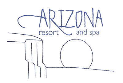
1.1. The Closure Law
Earlier we saw in the example of the photograph of the letter L, the so-called “Law of Closure”, this principle responds to the intention of our mind to close open elements and interpret them as a unit, rather than interpreting them as independent elements.
Applications
The Law of Closure, works better with simple, recognisable motifs than with complex patterns.
It is widely used in the creation of Logos because it reduces the complexity of the composition and simplifies the result, something essential in the design of Logos.
”"When this opportunity for closure is offered in a composition, the graphic designer creates an interactive experience for the viewer, who becomes involved in the communication and thus more intimately related to the process of assimilation, understanding and memory."
Fundamentos del diseño gráfico. Richard Poulin.Ed. Promopress.
1.2. The Law of Figure and Background
Another resource for creating visual unity in a composition is the use of the grid. It consists of repeating and approximating elements until a grid or pattern is formed. In this pattern we can distinguish some elements that are in front or that demand more attention and other more diffuse elements that will be the background.
The figure is the element that is in front and stands out, it is said to be positive. In general, it is what we perceive, while the background is what we do not perceive.
The background is the element behind and is said to be negative.
In this sense, we refer to another of the basic principles of visual perception to achieve visual unity: The Law of figure and background.
This perceptual principle states that human perception automatically separates figures from backgrounds. There is a tendency to perceive as figures those elements that attract more attention or are perceived better and as background those elements that are more neutral.
Applications
There are different ways of applying the figure-background principle, depending on what we want to achieve:
Nerea Díaz / Overture
Simple or Positive.
If we place the area we need to highlight in the composition in the positive area, we will obtain a balanced composition, where the figure is clearly perceived and the message is effective.
In the following example, we can see how more legibility is achieved in the version where we leave the background area (the sky) clear and place the text in the figure area (the earth).

In the following image, by placing the Logo at the bottom of the page, it becomes a figure, will receive more attention and will be better remembered than if it is placed at the top.


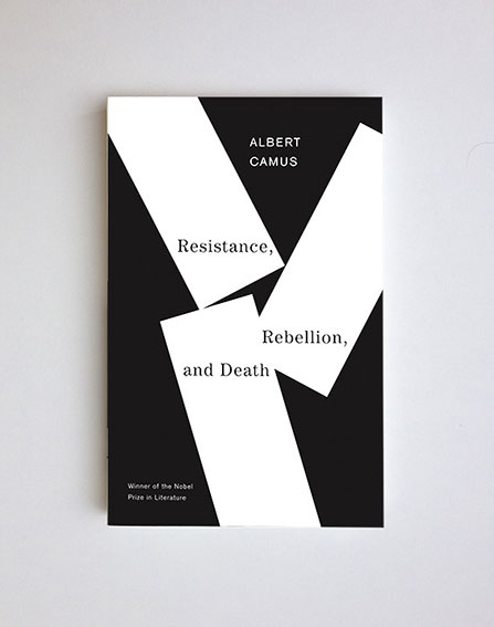
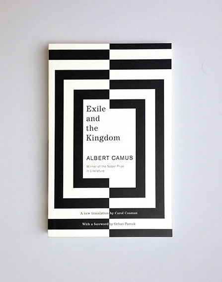
John Gall / Book Covers
Inverted or Negative.
But for a more demanding design where, in addition to clarity, it is necessary to attract attention, we can do an exercise of inverting the grid, putting the background in positive and the figure in negative.
Or make both areas legible, as M.C. Escher did in his fantastic images.
In these cases the composition becomes challenging and interactive for the viewer and therefore more interesting. They are active rather than passive designs.
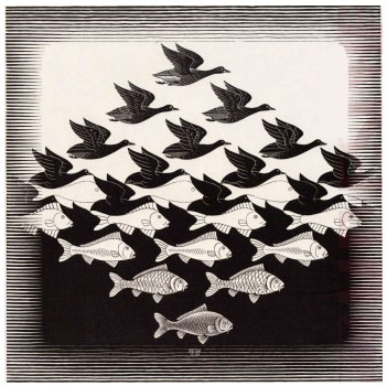
M.C. Escher / Wood engraving
2. Visual Tension or Weight.
Visual tension or weight is a graphic resource that basically consists of grouping elements according to their weight:
- Size.
- Contrast with the background.
- Centre or axis.
- Colour.
Through this grouping of elements we create points that attract each other in the image and arouse interest.
Tension is mainly used to capture attention in a composition.
Tension is generated when the internal energy of a composition is worked on as a whole, breaking or amplifying these forces.
Nerea Díaz / Contrapunto
2.1. The Law of Proximity.
The Law of Proximity is a basic principle of Gestalt that is related to the grouping of elements in a composition.
It states that close elements are perceived as a single group or fragment and are therefore interpreted as more related than elements that are separate. And even more so if these elements are also grouped by size, colour … etc.
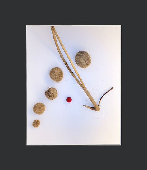
3. The Movement.
The main function of movement in visual communication is to guide the viewer’s gaze through and around the visual message.
A dynamic composition is one in which an illusion of movement is generated from the shapes or visual elements that compose it.
Visual techniques such as repetition and rhythm help to reinforce the characteristics of movement in a composition.
For example: Diagonal lines are much more active and dynamic than horizontal and vertical lines, or a circle is always more dynamic than a square.
Applications:
Key in the construction and organisation of multiple images, or sequences such as pages in books, magazines, motion graphics and websites.

Nerea Díaz / Emotion
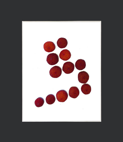
3.1. The Law of Continuity.
The Law of Continuity states that aligned elements are perceived as a single group or fragment with a greater relationship than non-aligned elements.
For example, a bar chart where the elements are aligned in increasing or decreasing order, so that the upper parts of the bars form a continuous line, will be more easily interpreted than if they were arranged without this visual relationship.
4. The Balance.
Unity is the basic principle in design to organise information in a coherent and solid way. Tension and Movement are principles that also bring expressiveness to the message and guide the viewer’s gaze.
A balanced composition is one in which all elements are evenly distributed and arranged to communicate a sense of stability and harmony.
There are two types of equilibrium:
- Simétrico
- Asymmetric
Symmetry.
The most obvious type of balance is that which occurs in a symmetrical composition. It is the easiest to achieve in a visual composition.
It can be a mirror image or reflection, where one part is a reflection of the other part of the image. Or it can generate a symmetrical compensation of their visual weights, although one part of the image is not exactly a reflection of the other.
The use of symmetry is recommended for designs where a sense of stability and classicism is the main concern.
”Symmetry is static and silent, it may seem boring, but it is nevertheless a fundamental and timeless principle of visual perception in visual communication.
Fundamentos del diseño gráfico. Richard Poulin.Ed.Promopress
Nerea Díaz / Eolo
Asymmetry.
However, an asymmetrical composition is not synonymous with an unbalanced composition.
Asymmetry or dynamic balance is more interesting and more difficult to achieve.
It requires planning as the image has to be composed by deliberately arranging the elements unevenly, but compensating with weights and tensions so that it always appears visually balanced.
The resulting image is expressive and generates movement.
Nerea Díaz / Password
If you liked it, I think you will find the following publication interesting: Creative Processes. It explains the methodology I follow to apply these fundamentals of graphic design and visual perception in my designs.
- The Language os Graphic Design. Richard Poulin. Ed. Promopress.
- Universal Principles of Design. V.V.A.A. Ed. Blume.
Framed images:
Created during the Domestika course given by Pepe Gimeno: The laws of visual perception: unity, weight, balance and movement.


