

Colour, meaning and creativity.
In this post we will unravel the meaning of colours.
The cognitive sciences are a set of disciplines dedicated to the study of the mechanisms of thought. They include neuroscience, artificial intelligence and, of course, psychology. In the case of colour, colour psychology is concerned with explaining how our brain constructs mental concepts from knowledge of a particular colour.
1. How do colours affect us psychologically?
In the previous post on the Theory of colour, we discovered colour in its physical facet, from it we deduce that colour reaches us through the senses and therefore in this post we can affirm that as well as light, colour is a perception. Colour highlights and stimulates our senses, awakens the mind and generates visual impact.
The use of colour as a communication tool is very powerful, as it can persuade, warn, manipulate, and even emote.
”The dominant component of our sensory perception is visual. And we all rely on that preference, even the visually impaired, because they can generate inner visual and spatial representations.
Sketchnoting. Pensamiento visual para ordenar ideas y fomentar la creatividad. Ed.GGAudrey Akoun. Philippe Boukobza. Isabelle Pailleau.
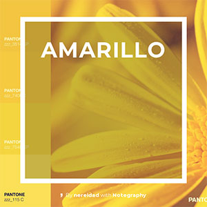
YELLOW
This is the colour that represents optimism, but also the one that defines anger and lies, it is said to be a very ambiguous colour and not very stable technically speaking, because it is a colour that absorbs the mixture of the other colours easily, without putting up resistance.
It is the brightest and lightest of the bright colours, making it very light and volatile.
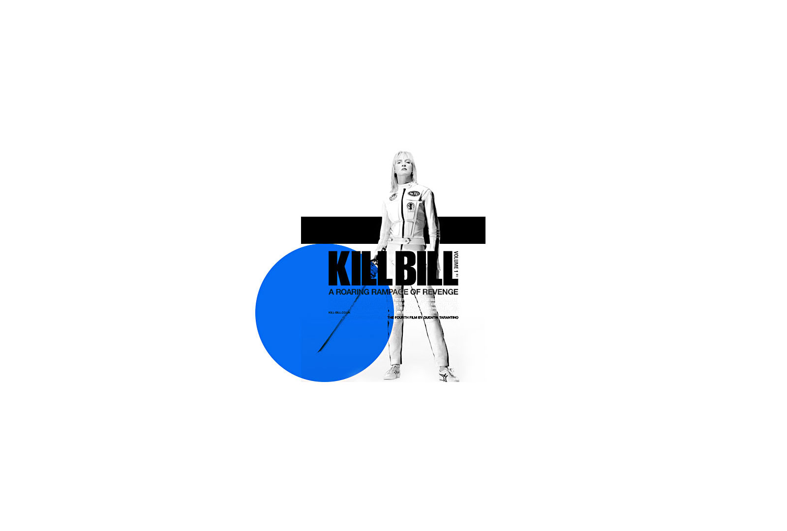
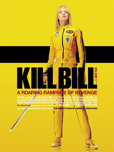
It is more striking than red, because next to black it creates the combination of maximum contrast in the colour spectrum, which is why it is used in nature by some animals as a warning signal and is the colour universally used together with black in warning and danger signs. (as an example, see the Kill Bill poster).
TIP: The lightness of yellow is intensified with pink and becomes denser and more solid when combined with red or orange, with which it acquires greater power.
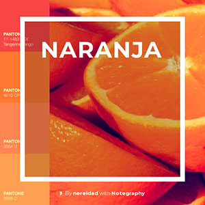
ORANGE
This colour takes on all the positivity of yellow, adding feelings of confidence and happiness. It is a colour that, being between red and yellow, has a degree of balance that makes it very appreciated to give an idea of balanced and controlled energy.
Orange is full of energy and is associated with physical activity and spiritual enlightenment.
TIP: Very suitable for brands that want to transmit youth, dynamism but also proactive behaviour on the part of the consumer, as it is a colour that, together with red and yellow, stimulates appetite and flavours.
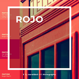
RED
The colour of passion, danger and blood. It is the most emotional of colours, its effect is persistent and long-lasting, it fixes itself in the retina and seems to move forward in space. That is why it is the most used colour in advertising as it stands out from its frame and acquires three-dimensionality.
Red raises blood pressure and increases respiratory rate, it is a colour that conveys a sense of urgency. It is used in signage to indicate danger and in advertising to provoke compulsive consumer reactions as it is the most stimulating of all colours.
TIP: Used with caution and choosing the most appropriate range of red depending on the case, it conveys closeness and forcefulness. It is the most commonly used in communication.
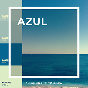
BLUE
It has been said that the colour blue belongs to the metaphysical world and in many cultures it is related to the divine. It is a spiritual colour that, as we have said before, concentrates on itself and seems to move away. It produces serenity and calmness and for this reason it is used to transmit feelings of confidence and security, especially in its darker tones such as navy blue.
Stability, loyalty, wisdom and eternity are also connotations associated with the colour blue.
It is a passive colour and formerly related to the masculine world because it represents reason as opposed to the passion represented by the colour red.
TIP: It is often used to express qualities related to intelligence and concentration.
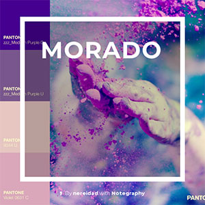
PURPLE
The colour purple or violet is created by mixing red and blue. It is a complementary colour that brings together the opposite sensations of its two primary colours. The colour purple therefore has an ambiguous association. On the one hand it is related to mysticism, extravagance, power and on the other hand, in its more pastel shades with a mixture of white, it is associated with gentleness, moderation and maturity.
It is related to “the feminine” and expresses contradictory sensations as it is culturally related to the tension between passion and suffering.
On an intellectual level, purple is related to fantasy and the unreal. It is associated with artists and the magical.
TIP: That’s why it works so well for communications for art meetings or creative events.
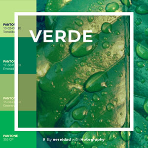
GREEN
This colour represents nature and growth at its best. It is a harmonious colour that exudes generosity and cooperation. It is associated with medicine and health. It is also associated with the supernatural world, the unknown (see Alfred Hitchcock’s use of it).
Green lets us pass through, opens doors and gives us hope. So green is more than a colour, it is an aptitude.
TIP: It is a very appropriate colour to represent new companies or projects.
2. How to create solid and harmonious colour palettes?
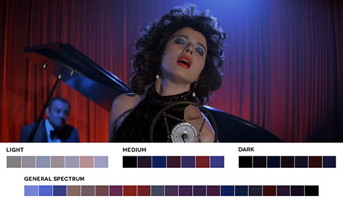
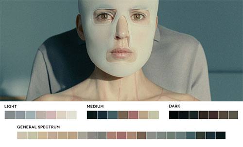
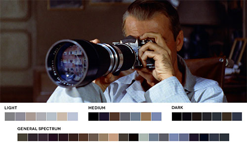
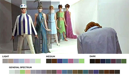
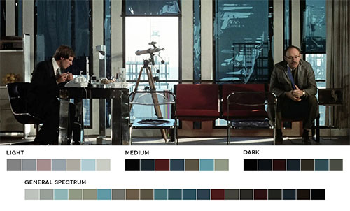
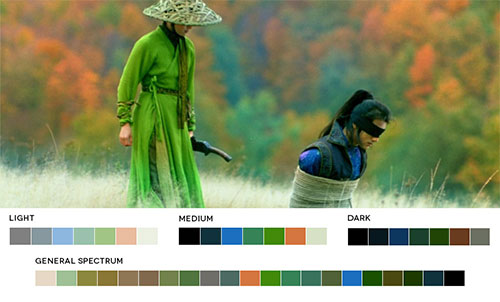
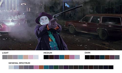
Film will serve as a support to illustrate the different colour palettes that are used as a reference during the colour grading process to give unity and emotional meaning to each shot. Movies in colour, is a website where the graphic designer Roxy Raduleschu shows us the colour palettes used in different films of all times.
In order to work with colours according to a guide, film colourists work with a tool called the colour wheel or chromatic circle. In the same way, when creating a Logo or a Website, I also use the colour wheel to find a suitable colour scheme that expresses “the tone” or indicates the theme of the website or logo.
By combining colours according to their closeness or remoteness on the colour wheel, visual harmonies can be created that convey certain emotions.
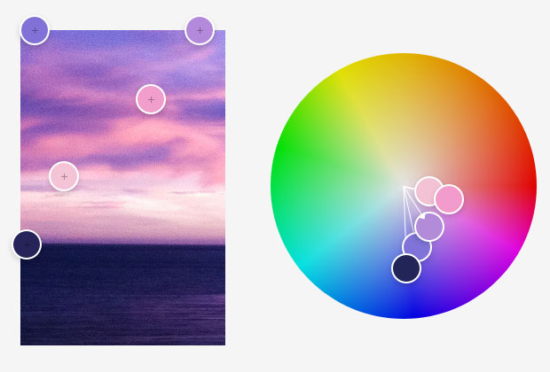
Analogue colour palette
1. Colour palettes or harmonies.
The most commonly used colour harmonies are monochromatic, formed by a single colour.
Other color combinations are complementary or opposite colors in the color circle.
Another colour combinations are analogous or combinations of adjacent colours on the chromatic circle.
Finally the most complex combinations in which more than three different colour tones come into play, such as triads.
If you want to experiment with creating interesting colour combinations online you can do so in Adobe Color.
2. The narrative use of colour.
Colours tell stories, place us in a certain space and time and have the ability to move us. Choosing the right colour palette when building a narrative discourse is much more complex, colours will be a timeline, a before and after.
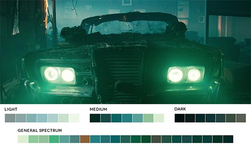
In the image of the still from Hitchcock’s film “Vertigo”, the female character is staying in a Hotel with a constantly flashing green neon light.
”This allowed me to naturally provoke the effect of mystery on the girl when she comes out of the bathroom: she is illuminated by the green neon, she is truly back from the dead. Then Stewart is framed, looking at her, and then the girl again, but this time filmed normally, as Stewart has returned to reality.
Revista YokorobuAlfred Hitchcock.
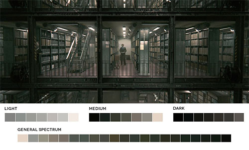
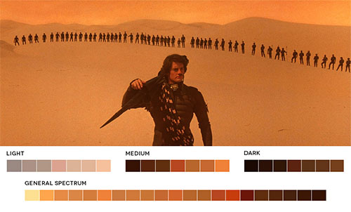
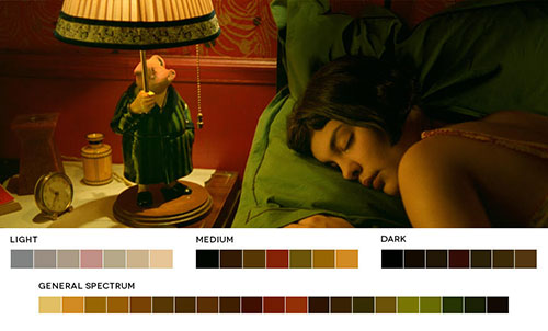
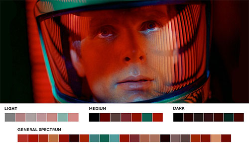
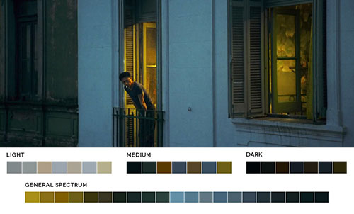
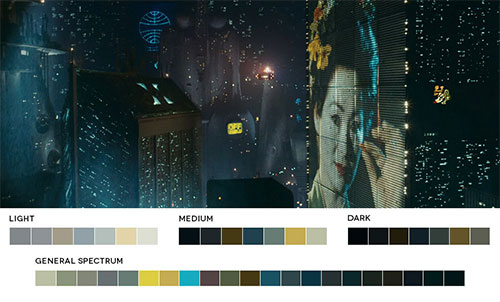
These are just a few examples, but in cinema we can see how the use of colour is definitely one more tool at the service of the ideation of precise atmospheres and epochs or diffuse interior worlds.
Through the appropriate use and combination of colours and the contrasts between them,we can not only make our message clear but also focus attention on the most important thing or that which, like the “Leitmotif”, will be repeated at decisive moments in the narrative, reminding us of the essence of the story.


