

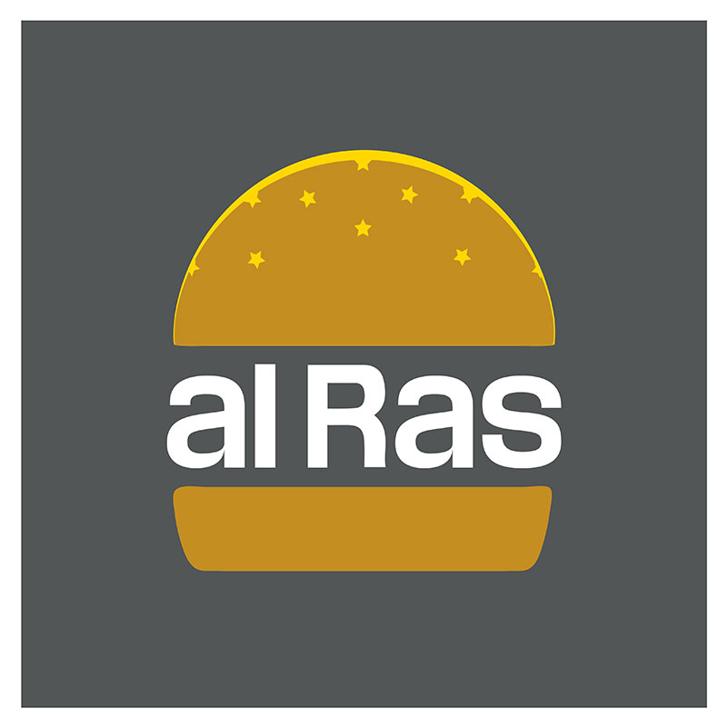
“A l’aire lliure”, the meaning of the name of this Restaurant in Guadalest, a small village in the mountains of Alicante, was the challenge for the creation of its Logo. It was necessary to conceptualize an expression “al Ras” (way of being) with a type of food “Food to eat with your hands” (way of eating).
Emotional inspiration is our project motto. Because the Restaurant is a tribute to the roots, to the best childhood memories, to feeling at home.
Graphic Design.
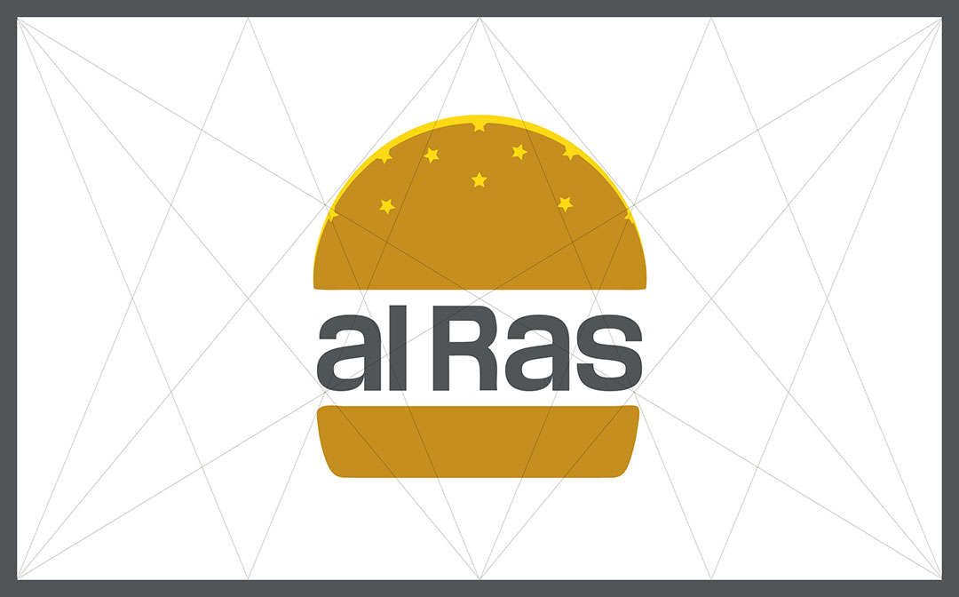
After finding the shape that generated the design, starting from the similarity between a hamburger and a starry sky, a great typography was created to adapt to small spaces and with colossal lowercase letters, creating a dense texture capable of generating the filling we needed.
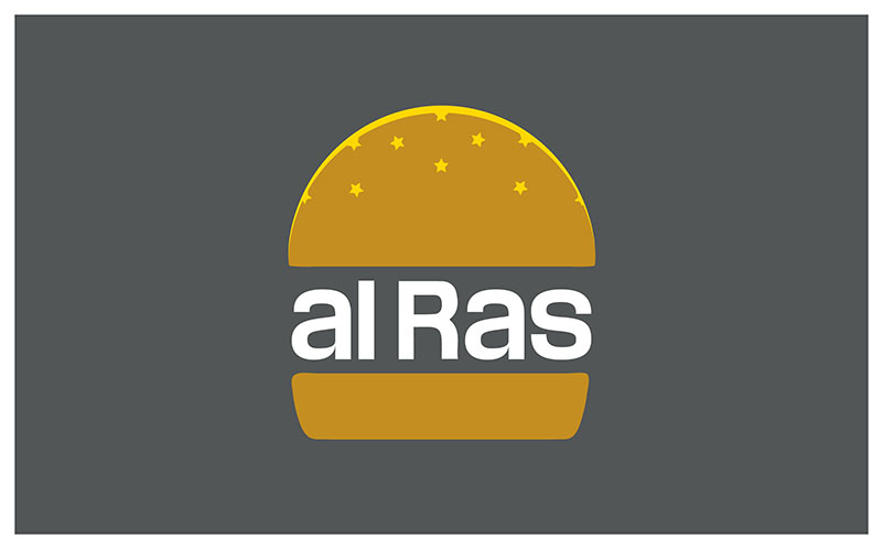
The primary colour is an appropriate mustard tone to suggest the toasted colour of the bread. As an accent colour, a yellow to give the vibrant note of the stars and the skyline, which helps to draw the silhouette of the semicircle especially in the smaller versions. Grey, instead of black for the lettering and the negative versions, brings softness to the whole.
#4B4F54
#C69214
#FFCD00


Logotype.
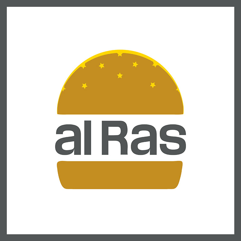
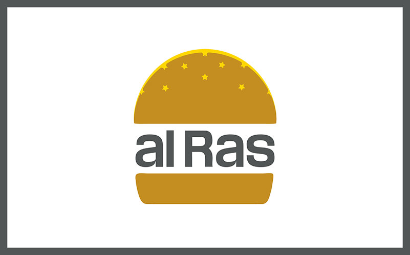
The design is an Isologotype, which is the name given to Logos, whose form is indivisible. In other words, the letters (Logo) cannot be separated from the symbol (Isotype).
It has two versions, one inscribed in a golden rectangle and the other square, capable of adapting to the smallest spaces.
The frame that surrounds the Logotype gives it entity and stability.
Visual communication.
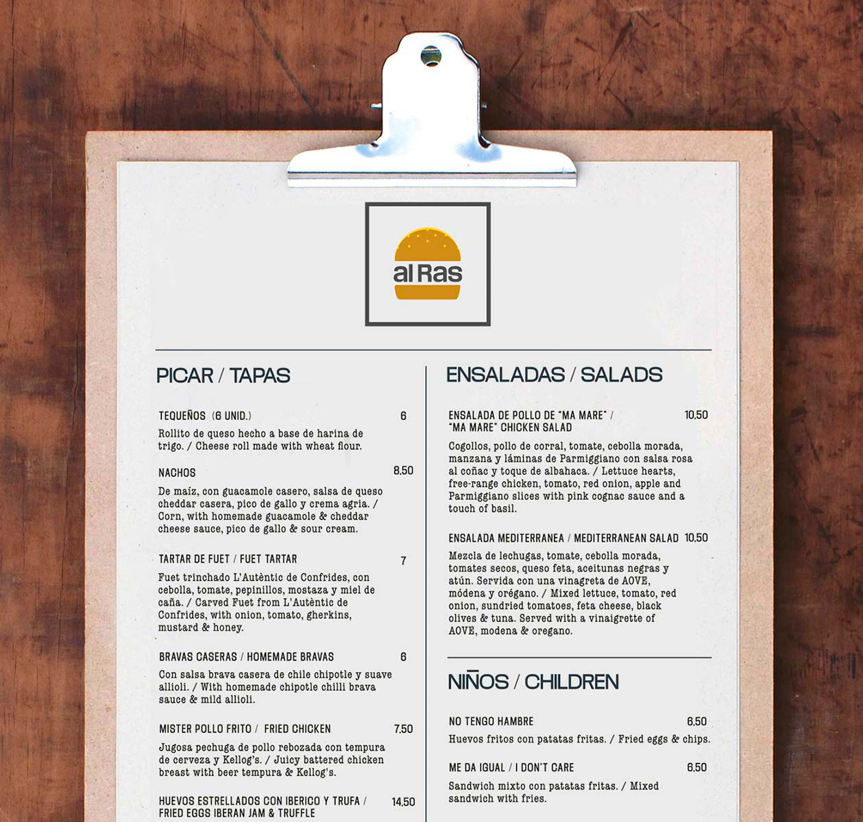
The design for the restaurant menu was simple and in keeping with the aesthetics of the premises. For this, we chose a typeface: American Typewriter, reminiscent of the old New York cafés of the 1950s.


Blog.
Related Posts
