

Renewing the current image of Podiatry was the starting point for the creation of this brand. The naming and Logo are focused on conferring a differentiating character of modernity and innovation with the aim of highlighting the importance of foot care.
The corporate manual created in the Branding work contains the guidelines so that the subsequent development of the brand remains consistent with the aim of creating its own visual language that allows fluid and natural communication without interruptions.
Services.
What has been done.
-
“Naming” is putting the name to the brand.
-
Logotype.
-
Icons and Photography.
-
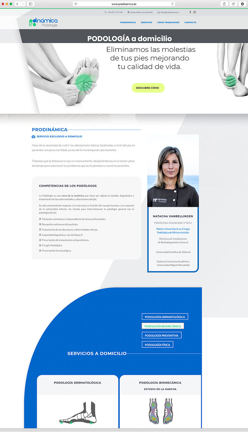
Word Press Web.
-
Corporate stationery.
-
Signage and vinyls.
-
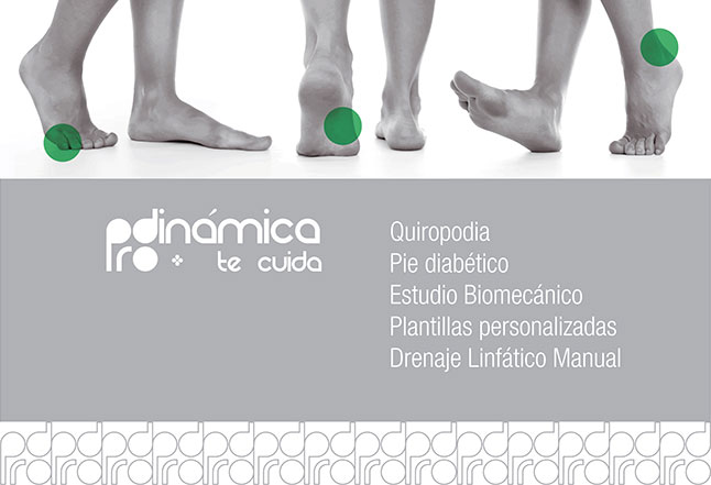
Advertising brochure.
Graphic Design.
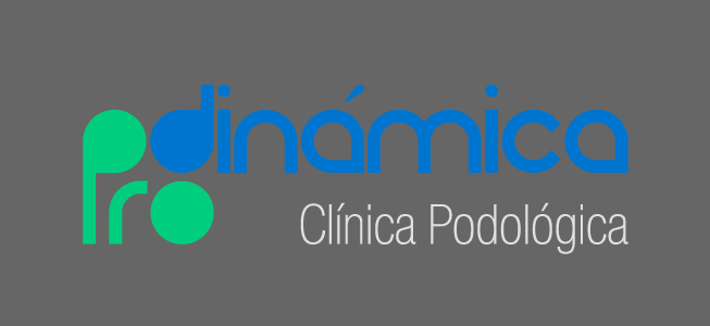
The Branding of Prodinámica stands out with the colours blue and green, chosen for the sensations transmitted and which position the brand in its corporate context: health and wellbeing.
The primary typography chosen stands out for the geometry of its structures, which makes them comfortable and organic; linking scientific rationalism with humanism. As a secondary typeface, the Helvetica Neue family was chosen, which balances the result by providing neutrality, clarity and seriousness.
#0076ce
#26d07c
#666666


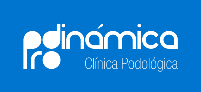
Logotype.
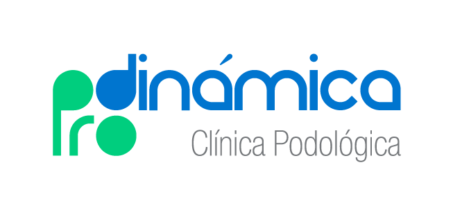
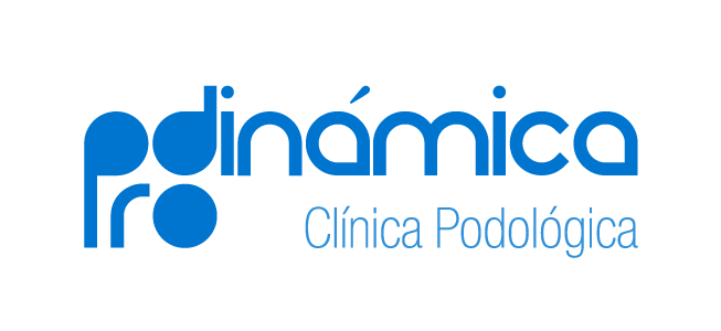
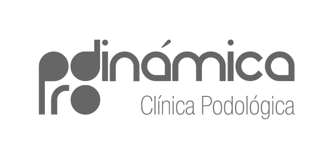
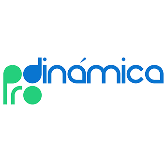
The Logosymbol represents the three points of support of the foot, which provide balance and organicity to the graphics. The rounded shapes bring affability and dynamism, at the same time as they provide empathy and closeness to a Logo that wants to transmit an image of security and confidence.
Several versions of the Logo are designed: full colour, as well as two monochrome versions, one in blue for the Clinic’s corporate material and one in black and white.


Dermatologic

Biomechanical

Preventive

Physical
Web Iconography / Podiatry services.
Web Design.
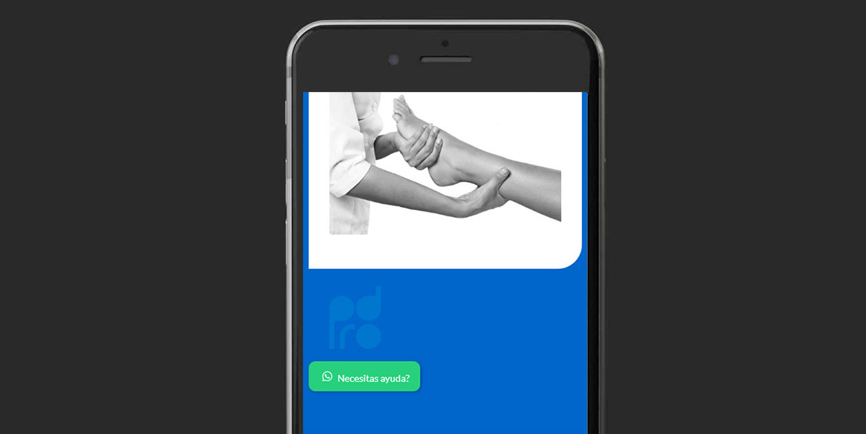
The website created is an Onepage with a Blog section, fully customised with the rounded shapes of the Logo and its own visual language. In addition, a series of icons were created to define the medical services offered.
Visual Comunication.
A tonal reduction based on duotones results in a distinctive image that is chromatically simple and economical to reproduce, as the number of inks is reduced in the case of Pantone printing.
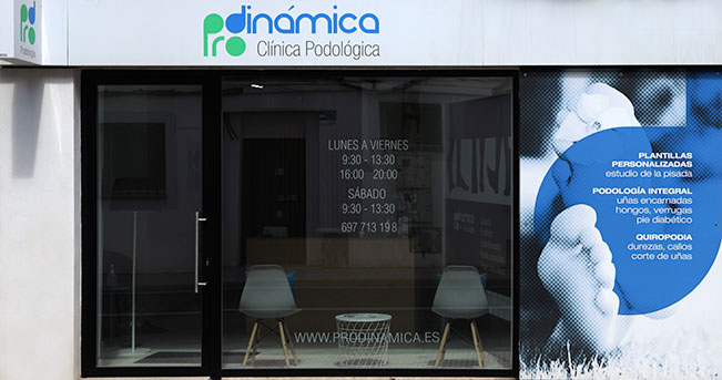
Outdoor sign / Aluminium plate.

Indoor sign / Acid-etched vinyl

Advertising brochure.
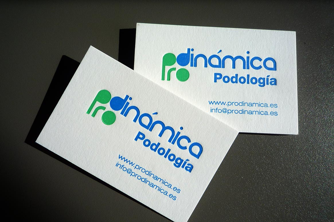
Business cards / Letterpress Pantone.
Blog.
Related Posts
