


In this post we will look at how to make sense of the chaos. In other words, how to organise the content of our website. We will use techniques to organise information in a logical way.
¿What makes a website structure good? Do you know how to create a user-friendly design for your visitors?
We will answer these questions with examples and useful methods available to everyone.
0. Content and structure.
Do we know what our users are looking for? Answering this question, we’ll organize the content. We have to put ourselves in their shoes, imagine what we would look for if we were the user and we were in their situation.
Start by making.. a diagram
Before you start writing, think of the content as blocks of content. This way, you will have a global vision of what you want to achieve. Don’t start writing without rhyme or reason. Keep in mind that people don’t read a website, people scan the content. It doesn’t help to fill the space with words that will only add visual noise.
To start you need to be clear about what you want your website and what function it will have within your business strategy.
”Users want to achieve their goal with as little effort as possible. What we see when looking at a website depends on what we have in our mind, even if it is only a fraction of what is on the page. We see what we want to see.
Steve Krug.No me hagas pensar.Ed. Anaya Multimedia 2014
”We are taught to solve problems by following standard procedures. This is not valid for a constantly changing digital and creative world. We need out of the box tools that help us to think and enhance creativity.
Cris Busquets.Diseño desde Marte. Manual de diseño de producto digital.Ed. Jardin de monos.
Organize your steps
1. What is a user looking for when visiting a site like yours? Do your research to design an effective solution. 2. Design a skeleton with important information.
Design is solving problems in a certain way.
3. Aesthetics come later. Before you think about fonts and colors, you have to have the content well structured. If the skeleton is not well formed, when we try to browsing the web, the user will not find the way easily and will be frustrated leaving the web.
”If I had an hour to solve a problem, I would spend fifty minutes thinking about the problem and five minutes thinking about solutions.
Albert Einstein.
Information architecture.
The art of organizing complex information as clearly and logically as possible.
Through careful planning of the structure, content and navigation of the web, the user experience (UX) is improved, which means that its usability is facilitated and SEO is improved.
A website needs to organise its content based on a flexible structure that takes into account the growth and evolution of the site. To do this, information needs to be classified, using categories for broader topics and tags for more specific content. For example, as categories on a website that publishes media reviews, we could have: Books, Cinema, Series… As tags, however, we would have more specific terms, for example: Essay, Poetry, Science fiction, Zombies… It is like making an “inventory” of each essential block of website content. It is important to group as many categories as possible; it is not advisable to have too many. This classification of content into categories and tags will allow you to find keywords and organise the information.
You can start by creating a mind map with your initial ideas on how you’d like to organize your web content. If you need to present this diagram at a meeting, a quick and simple online tool is Miro.
Information architecture.
Case studies
Essential points to structure information.
-
Identify the needs of users.
-
Establish a hierarchy of contents by levels and group them into categories with logic.
-
Create a navigation structure that facilitates content localization and understanding.
1. The user’s needs.
-
Identify the needs of users.
1. Case study:
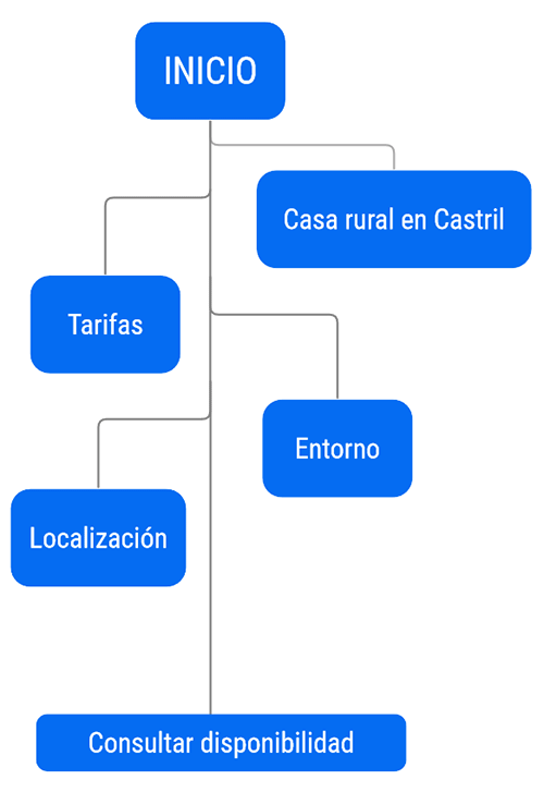
Renewal of the El Gandulillo website, a rural accommodation.
The main problem with the previous website was the lack of relevant content for the user, such as a tariff page. On the other hand, the target client of El Gandulillo, a traditional rural house, responded to an active tourist profile, a lover of nature and outdoor activities. The important information for the user had to include a section on the natural environment of the rural house. We also linked to this content, including various nature trails. Even with Wikiloc, a website specialising in routes and trails.
Schematic outline - Level 1 - Flowchart.
We use the term “mobile first” to mean that we first design and organise the placement of content blocks as they would appear on mobile devices. The design for other devices is then developed. The tree diagram below shows the first level of content with the most important information.
- “Casa rural en Castril”,contains the keywords chosen for the SEO of this page.
Interactive statements are accessible from the home page, with click-through to relevant content.
2. Information categories.
-
Establish a hierarchy of contents by levels and group them into categories with logic.
2. Case study:
Web created for the School of Arts and Letters of Altea.
Outline of contents - Level 1 - Wireframes.
After identifying the users’ needs and outlining the content, we proceed to prototyping. This involves visually organizing the content in a schematic way using wireframes. I prefer using a whiteboard as it allows me to observe the content from a distance and make modifications easily. Organising content is crucial in web design as it helps to identify the object or tool to be used. The School of Arts and Letters website’s homepage divides the screen into four coloured buttons, each corresponding to a category of the website. Clicking on a button redirects the user to another page. This design ensures easy navigation and clear identification of each page.
- The School.
- Visual arts workshop, finally named Drawing and Painting.
- Written arts workshop, renamed Writing.
- Publishing services.


Although ideas about the layout and design of the page can already be sketched out, wireframes essentially allow us to explore options for arranging the content visually and what options we can develop for each block.
Outline of contents - Level 1 - Wireframes.
Figma, Lunacy or Sketch are digital tools commonly used in wireframe development. These prototyping programs are useful when we are working in a team with a programmer on the same prototype. Wireframes focus on proposing solutions to organize and present information. For example, when designing the Prodinámica podiatry website, we faced the limitation of a One Page structure. This structure directs users to different sections of the home page through the main menu buttons.
- Prodinámica
- Services
- Blog
- Contact
However, in order to organise the content, it was thought to create anchor indexes for the Services section and the Blog. In the image below we can see the following interactive elements:
- MAIN MENU
- SERVICE INDEX
- RELATED POSTS BUTTONS
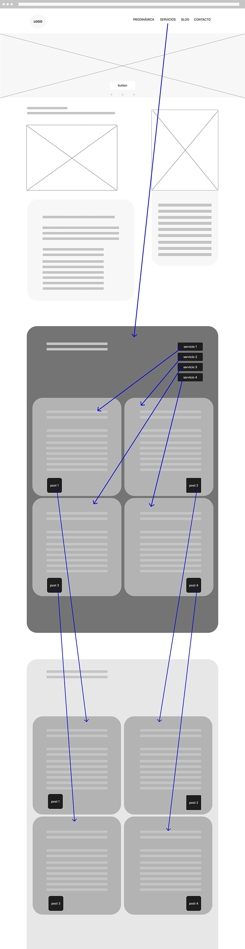
In this example, navigation is set up on three levels:
- Top menu with main navigation
- Index of services, inviting the user to navigate to the clinical service for which he/she needs information.
- At the end of each service, a button is added to a blog post related to the medical service.
Conclusion:
A website is an interactive digital product and as such we must first think about the user in order to create a structure that is suitable for its use. Once this skeleton has been created, we can give the website a look and feel, with the appropriate chromatic palettes and typography, but that will be the content of our next post: Designing a website with WordPress.
- Don’t make me think. Steve Krug. Ed. Anaya multimedia.
- Design from Mars. Digital product design manual. Cris Busquets. Ed. Jardín de monos.


