
The bite. method aims to revolutionise the concept of the sandwich. A clear mission based on a take away business model, but with a wide variety of choice of breads and fillings, without waiting or complications.
A Logo is created for this brand taking into account the proposed business concept, as well as the main users: walkers and strollers, in any case an active customer.
Services.
-
Branding.
-
Graphic Design.
-
Visual Comunication.
What has been done.
-
Logotype.
-
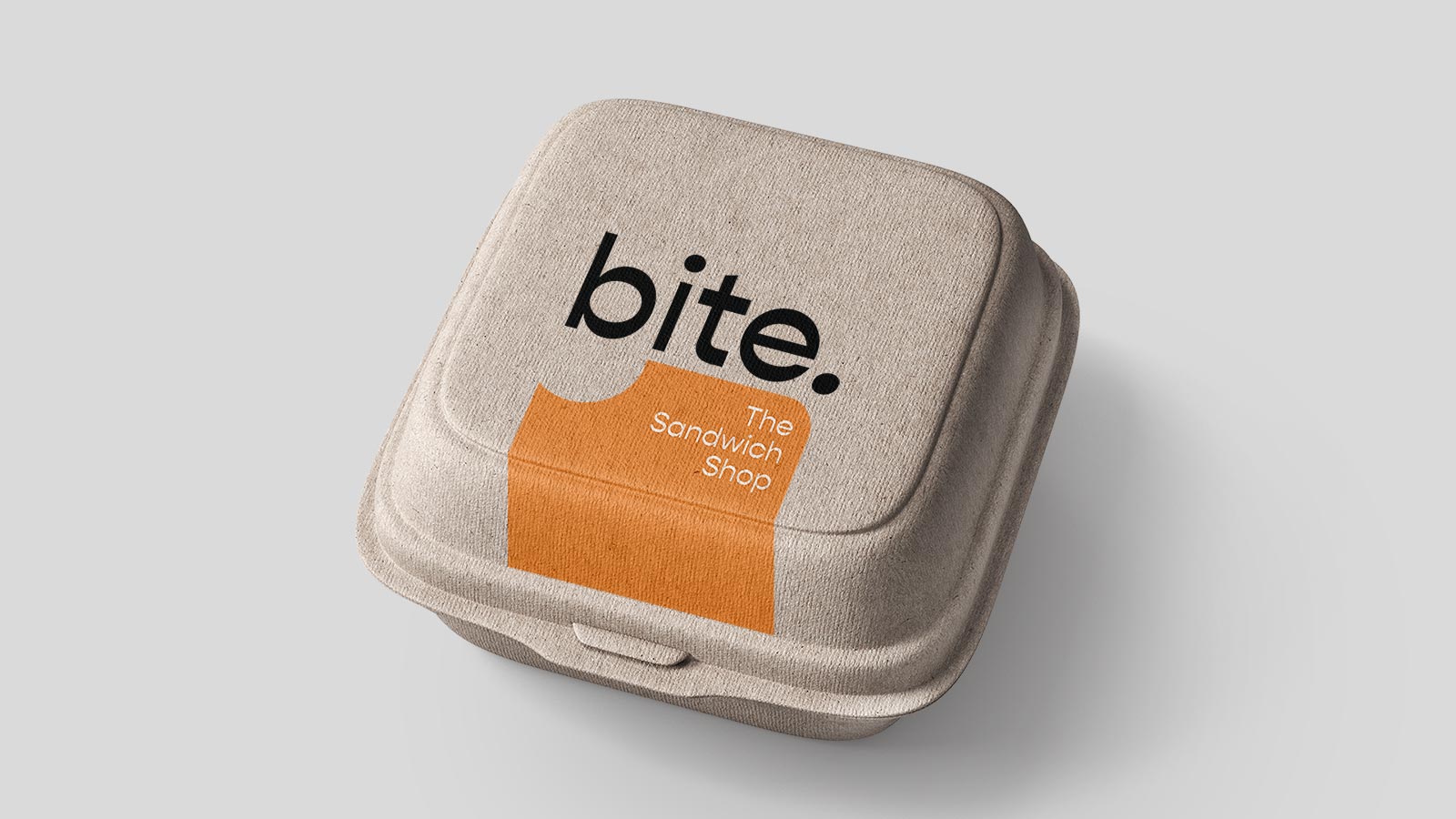
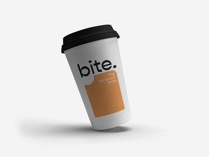
Packaging Proposal.
-
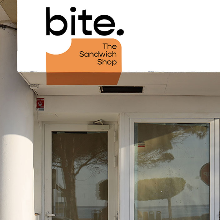
Proposal for signage on the facade.
Graphic Design.
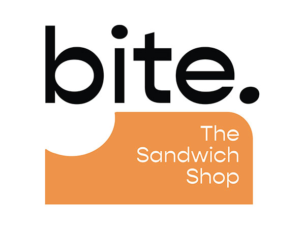
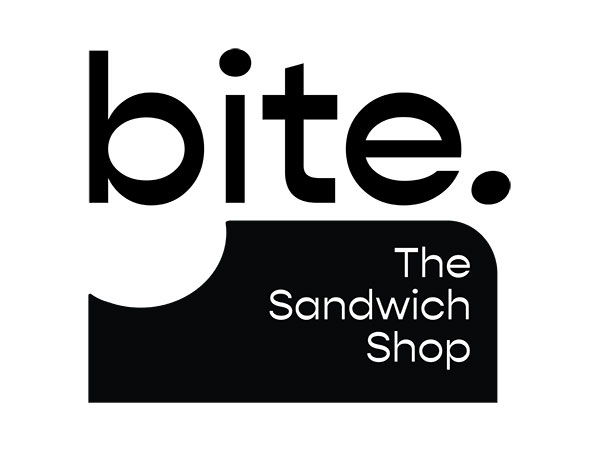
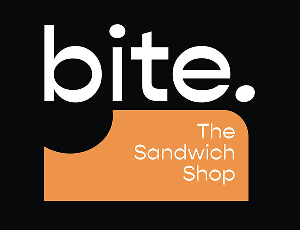
The Logo is defined thanks to the wonderful Gopher typeface, which plays with the contrasts of the lines that in some strokes narrow and in others widen, giving a special vibration and undulation to the graphics.
#ec9248
#000000


Logotype.
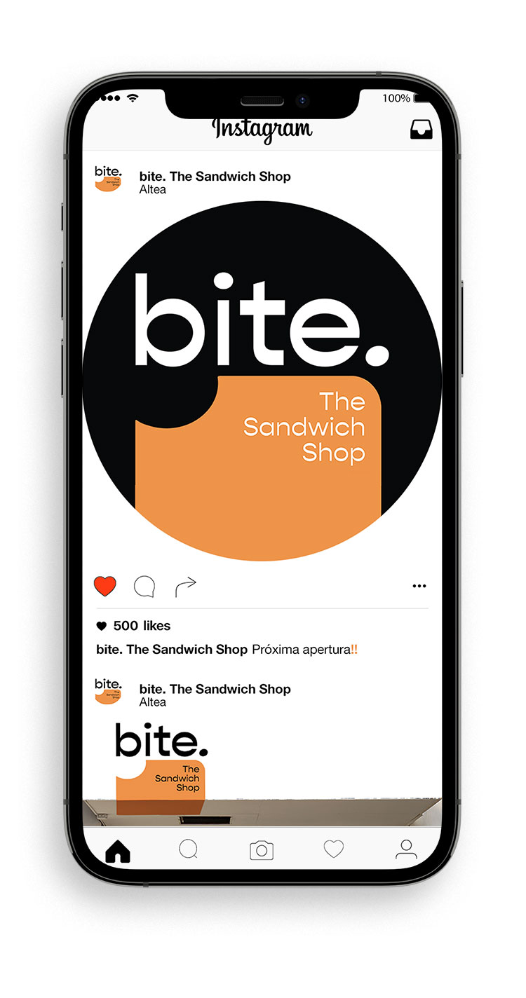
The Logo has the peculiarity of being able to expand its toast silhouette background to adapt to the shape of the surface where it can be placed. See, for example, the packaging or the commercial sign, as well as the rounded background designed for the social media profiles.
The dot is an important part of the Logo so it was intentionally placed in the rounded corner of the toast so that it looks like it is about to roll.


Visual Comunication.
A proposal was made for commercial signage for the facade, adapting the Logo to the space by means of two printed aluminium plates and a vinyl with a graphic illustration.
We also proposed the application of the Logo to the packaging for the drinks and sandwiches.